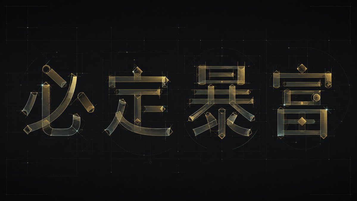
Architectural typography poster retro
Prompt
Generate a set of experimental Chinese typography designs around a specific theme word. Deconstruct each Chinese character into a clearly recognizable skeleton, horizontal and vertical structural rods, curved strokes, and a small number of geometric components, then reassemble them into glyphs using the same modular logic. The subject should not rely on ordinary font outlines, but be composed of thin lines and semi-transparent color blocks, like transparent architectural drawings: long horizontal strokes maintain a stable horizontal order, vertical strokes carry slight tilted tension, corners retain sharp angles, and major curves sweep through the internal space with a large radius, forming a fusion of calligraphic strokes and geometric engineering. Maintain ample negative space and balanced visual weight between characters; local strokes may interpenetrate, overlap, or be misaligned, but the text must remain readable. Repeated horizontal lines, vertical lines, diamond dots, circles, or curved nodes play a rhythmic role, making this set of characters look like a unified font system rather than individual decorative characters. Colors are extracted from the theme's materials, emotions, and semantics, maintaining the relationship between a high-brightness clean background, low-saturation semi-transparent primary colors, slightly darker thin outlines, and a very small number of clear accent points. The overall appearance is bright, transparent, light, and precisely designed. The image completion should be between a typography design sketch and a brand identity, with clean edges, visible transparent layers, restrained line widths, avoiding heavy solid fonts, dirty gray retro textures, casual handwriting, and common poster layout.