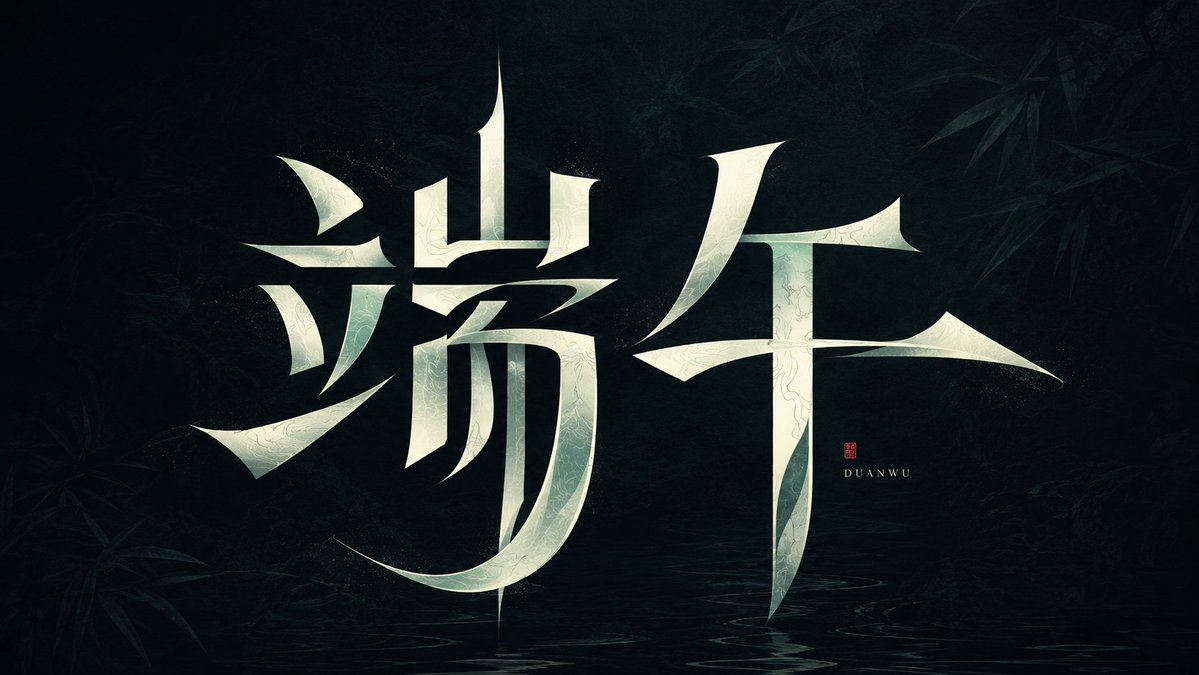
Modern heterogeneous Chinese typography design
Prompt
Generate a set of highly original Chinese typography designs around a specific theme word, making the glyphs themselves the core visual element. Preserve the most critical readable skeleton of each Chinese character, then deconstruct radicals and strokes into graphic components with modern calligraphic tension: vertical strokes form stable axes, while horizontal, left-falling, and right-falling strokes transform into sharp wedge-shaped endings, floating short strokes, arced sweeps, and carved-like turns. Local strokes may be broken, misaligned, compressed, or stretched, but negative space must participate in glyph construction, placing the text at a balance point between clear readability and defamiliarization. The main Chinese characters occupy the strongest visual weight, with restrained negative space around them; form a clear density rhythm between dense and empty areas. You may add tiny English transliterations or signatures to create proportional contrast, placed close to the main Chinese characters but not overpowering them. Colors are extracted from the theme's emotions, materials, and cultural temperament, maintaining the relationship between a low-interference background field and high-brightness main characters: the background can be a quiet dark field, a soft light-and-shadow field, or a low-saturation projection of the theme material. The main Chinese characters use clean, bright light colors or theme highlight colors, creating a calm, mysterious, sharp, and unforgettable high-contrast effect. Edges should remain sharp, weight variations should have design intent, and turns should present a folded, cut, or slightly floating texture. The overall presentation is a customized Chinese character logo, strongly experimental but not cluttered, with Oriental charm derived from structure and brushwork rather than relying on traditional calligraphic decoration.