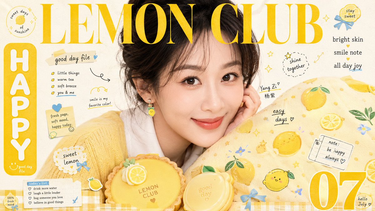
Sweet Life Magazine Cover Portrait
Prompt
Build a sweet lifestyle magazine cover visual around any subject: let the core subject occupy the upper-middle part of the frame, using a close-up, large-scale, slightly off-center pose, with edges naturally extending out of the frame to retain the companionship of intimate eye contact or close-range display. In the lower foreground, place a rounded, textured prop, with the right side to the bottom surrounded and partially obscured by a large soft patterned carrier, forming a continuous diagonal embrace between the subject, prop, and printed surface. At the top, place an oversized, high-contrast serif Latin letter title, overlapping the upper edge of the subject. The font color should be taken from the most vivid warm tone in the theme, strokes should remain clear, while allowing slight obscuring by the subject's outline. On the left, set a rounded solid-color vertical label with bold white letters; on the right, arrange compact short text; in one bottom corner, place an oversized single number or symbol. Fill the remaining blank space with a small amount of fine Latin text, handwritten lines, and short phrases, creating a four-stage reading rhythm of large type, vertical label, number, and micro text. Decorative elements derive from the theme's semantics, transformed into small colorful clips, badges, and flat symbols attached to the subject's outline and the carrier surface. Use rounded contours, candy-like medium-high saturation colors, and slightly irregular arrangements that echo the dense dots and cartoon icons on the carrier. Use bright, clean milky white as the largest-area background color. The main warm tones derived from the theme are used for the title, logo, and large areas of the carrier. Dark colors are used only to stabilize contours, and a small amount of cool/warm accent colors is concentrated on small accessories. Maintain high brightness, transparency, and a sense of delight; the area of the main warm tone is significantly larger than other colors. The color tone derives from the theme's meaning, not fixed to specific values. Use soft front flash and even fill light, making the subject's surface delicate and bright, with short soft shadows. The rounded foreground prop has a delicate, creamy matte sculptural feel, and the surrounding carrier has the delicate texture of soft fabric. At the bottom edge, add a two-color checkered narrow band derived from the theme as a finishing touch, maintaining a light paper surface and sparse white space in the background. The final image should have a mixed texture of sweet magazine photography and print typography: the photo is clear and soft, the printed text has slight ink spread and subtle misregistration, and the light paper surface retains only subtle fibers and scan softening, without adding stains, yellowing, or film grain. The final effect should be information-dense while focusing on the subject's expression or core display. The large title must overlap the image, and the foreground prop and patterned carrier must create a cute, rich, close-up sense of visual crowding.