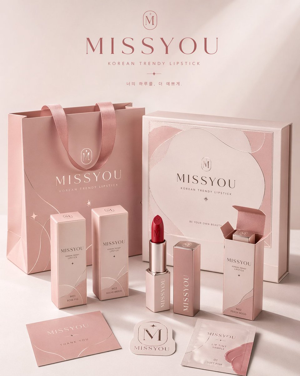
Professional brand packaging system
Prompt
Please create a high-aesthetic, high-completion "brand packaging system display image" for the brand in the category . This is not just an ordinary e-commerce white-background image or single product photo, but a display image with a brand proposal style. It needs to reflect "unified presentation of a single brand across multiple packaging carriers", showcasing the complete packaging system of a mature consumer brand. [Ratio requirement] The overall composition must be a fixed 4:5 vertical poster. Horizontal composition or scattered arrangement is prohibited. The layout should follow poster reading logic: top negative space, center as the main visual focus of the packaging system, bottom for auxiliary packaging, labels, and products. The center of gravity should be concentrated, suitable for direct publication as a brand display poster. [Core requirements] Automatically match the most reasonable packaging combination according to [Product Category], and build a unified visual system around [Brand Name]. Choose a small number but representative packaging forms to form an exquisite system. Prioritize hierarchy, brand consistency, and display aesthetics over quantity. You may include: shopping bags, gift boxes, shipping boxes, long boxes, single-item boxes, pouches, sleeves, sample bags, bottles, jars, tubes, spray bottles, pump bottles, labels, stickers, hang tags, cards, and the products themselves. [Category adaptation] Adapt packaging forms according to [Product Category]: for example, bakery uses paper bags and food containers; coffee/tea drinks use cups and cup sleeves; beauty/skincare uses jars and tubes; fragrance/lifestyle uses candles and cards; fashion/collectibles use drawer boxes and hang tags. The result must match the category characteristics and be systematic. [Quantity control] Control the number of items, avoid crowding. The scene should follow the "less is more" principle. Suggestion: 1-2 large items, 2-3 medium items, 2-4 small items/labels, and 1-3 actual products. Total visible elements should be between 6-10. Ensure sufficient negative space and clear hierarchy. [Visual system] All packaging must belong to the same brand system, with [Brand Name] as the core element. Maintain consistent logo placement, typography style, graphics, illustration/pattern system, and material textures. The style can be minimal, organic, modern, luxurious, or youthful, but must be mature and high-quality. [Color mechanism] Avoid fixed combinations. Generate different color schemes, such as cream white/caramel brown, haze blue/warm white, olive green/linen beige, chocolate brown/ivory white, etc. Avoid neon colors or cheap high-saturation colors. Maintain a premium sense of restraint. [Composition] Use a commercial studio scene, with a 3/4 top-down or slight perspective view. Arrange in layers: large items in the background, core packaging in the midground, small items/products in the foreground. At least one product should interact with the packaging (for example, half-exposed from a box). Create a balanced triangular or staggered composition. [Visual style] High-end commercial photography texture. Clean studio background (white, warm white, light gray). Emphasize material textures (paper creases, box structure, bottle silhouette, print quality, embossing, matte/cotton/kraft paper textures). Modern and concise visual language. [Light and shadow] Commercial-grade lighting. Soft studio light or slight directional natural side light. Use clear but restrained light and shadow to add depth. Light should be transparent and bright, never dim or cluttered. [Final effect] The final image should look like a packaging proposal poster or visual landing page for a mature brand, emphasizing vertical poster feel, brand consistency, system completeness, and commercial photography quality.