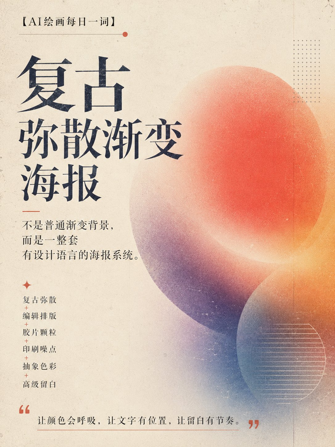
Recently I discovered an AI design direction especially suitable for posters, covers, and brand visuals:

Prompt
Retro diffuse gradient. It is not an ordinary gradient background, not a PPT cover, and not a cheap cyber neon image. It is more like an independent magazine cover, art exhibition poster, experimental music poster, or a visual draft in a design studio portfolio. The core temperament is: retro diffuse + editorial typography + film grain + print noise + abstract color + high-end negative space. 🎯 Core Prompt: Please generate a high-end retro diffuse gradient concept poster around 【theme word】. The overall style references independent magazine covers, art exhibition posters, experimental music posters, and avant-garde brand visuals. The image includes softly diffused color blocks, fogged edges, film grain, print noise, scan texture, paper texture, abstract geometric elements, and high-end editorial typography. The main title must be clearly readable, with orderly typography, negative space, and a sense of design. No human faces, no e-commerce feel, no cheap neon, no PPT template feel. The core structure of this type of prompt is: theme word + abstract color system + diffuse gradient + print grain + editorial typography + high-end negative space. 💡 Core Logic The key to this approach is not "making a good-looking gradient background," but establishing a complete visual system. First, colors must have a main logic. They can be high-saturation or low-saturation; they can be monochromatic or two-color conflict. But they cannot become a cheap rainbow gradient. Second, diffusion must have direction. Colors can scan horizontally, fog vertically, press in at the edges, leave negative space in the center, or slowly emerge like film developing. Third, text must hold its ground. The main title must be clearly readable. A sense of design is not making the text unreadable, but forming an order between text and image. One sentence to understand: Let colors breathe, let text have a position, let negative space have rhythm. 🔁 Extended Applications 🎵 Experimental Music Poster Can use strong contrasting colors, heavy grain, and oppressive large titles, suitable for performances, parties, and sound art themes. 🖼️ Art Exhibition Poster Suitable for low-saturation matte colors, large negative space, thin fonts, and abstract geometry, overall more restrained and high-end. 📚 Knowledge Card Cover Can use a light background, clear title, and soft diffuse background, suitable for "word of the day," "research notes," and "topic observations." 🛍️ Brand Visual Key Visual Use a unified color system and typography structure, can extend into brand event posters, social media covers, and WeChat official account header images. 🌐 X / Weibo Cover Horizontal format can emphasize title recognition; vertical format can be made into a magazine cover feel, suitable for personal IP column packaging. 📌 One-sentence summary The charm of retro diffuse gradient posters is not in the gradient itself, but in how it turns abstract color, print texture, and editorial typography into a work with a true design language.