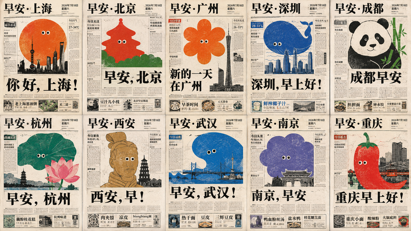
Generate a set of old-newspaper front-page style visuals around any theme subject: the overall look first resembles a local newspaper's…
Prompt
Generate a set of old newspaper front-page style visuals around any themed subject: overall it first reads like a full-page report from a local newspaper, with light warm-white newsprint dominating, thin black ruled boxes, narrow-column body text, a masthead at the top, dense vertical or horizontal column grids on the left and right, and a strip of small box ads along the bottom, together establishing reading order; then a huge flat illustration derived from the theme suddenly bursts into the center of the page and between the columns, a few irregular circular, elongated bar, or leaf-shaped outlines at naive scale overriding the text, their edges with slight misregistration and ink absorption on the paper, simplified down to just a clear silhouette, a few lines, and a pair of small round eyes, turning a serious newspaper into a friendly public notice. The core headline uses heavy black Ming-style letterforms, tight tracking, stable leading, placed below or beside the illustration to create a strong pause; subheads and body text keep the high-density grey-black text blocks of a real newspaper, with small documentary photos and thin-bordered Q&A boxes embedded locally, but do not let the photos steal the center of the page. Color derives from the theme itself, controlled to a newsprint base tone, black-grey text, two to three high-saturation spot-color large illustrations, and a small amount of low-saturation supporting color: the large color blocks are bright and clean but carry print grain, locally revealing paper fibers, slight smudges, creases, scan yellowing, and uneven ink; the aging happens mainly on the paper, the edges of black text, and inside solid color blocks, with no uniform brown dirtying. The layout is allowed to be crowded, staggered, and slightly misaligned, retaining childlike-drawing round-eye humor, the plain credibility of local news, and the reading interruption caused by illustrations weaving through the text; avoid modern magazine whitespace, smooth vectors, commercial studio photography feel, and overly refined typography.