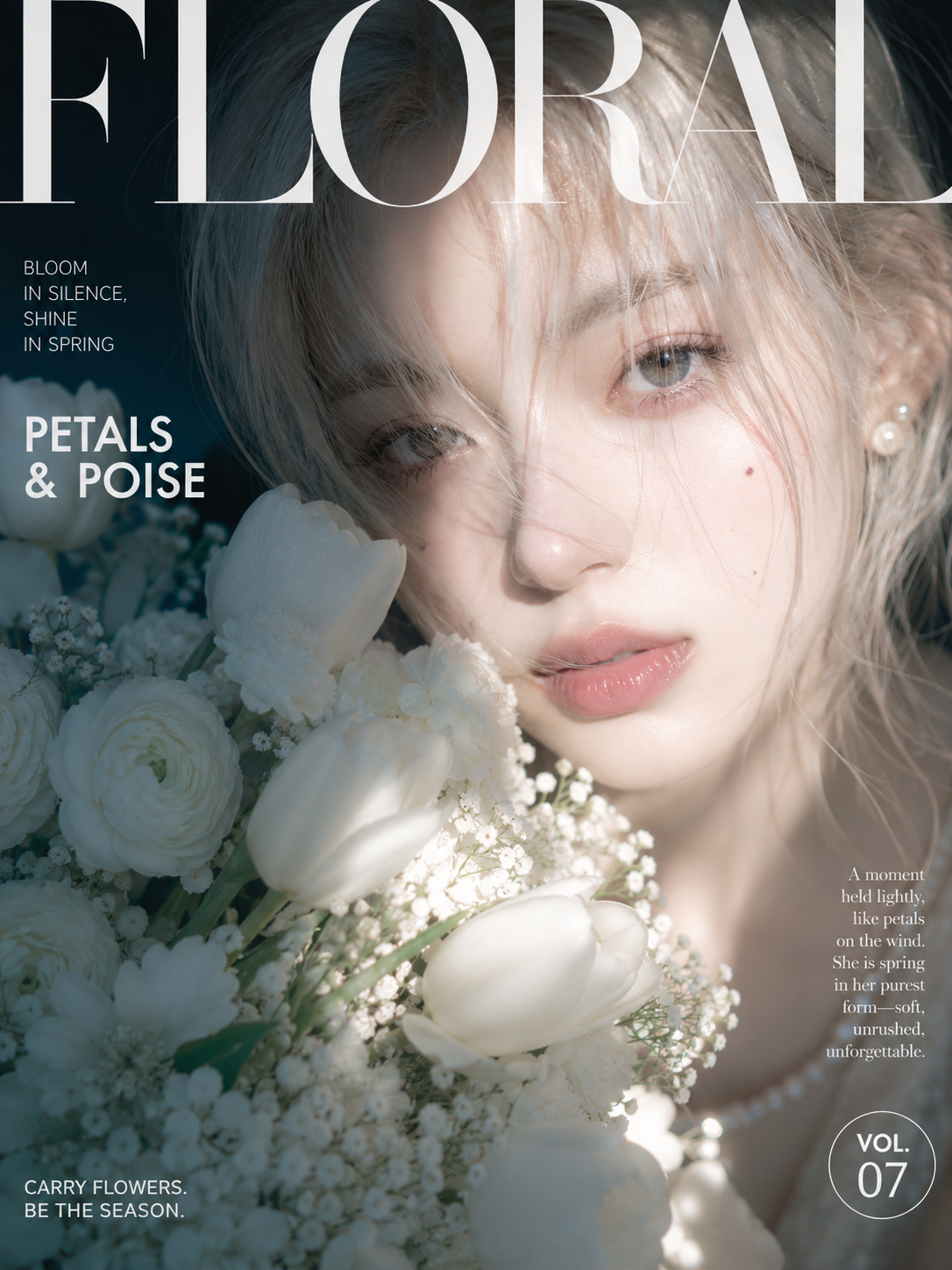
Build an intimate fashion magazine cover with the warmth of a private snapshot around any themed subject. Let the main…
Prompt
Build an intimate fashion magazine cover with the warmth of a private snapshot around any themed subject. Let the theme's core enter the frame at an extremely close distance, bold in scale, with key parts fully legible while the rest of the structure is naturally cropped by the edges; on one side of the foreground, place a fluffy aggregated form or grouped companion elements derived from the theme's semantics, its mass approaching the core and blocking the lower part, creating a rich tactile feel of a close-up surge. Keep the background deep, dark, and low in detail, revealing only a few environmental outlines, locking the gaze onto the lit area. Across the top runs a line of oversized high-contrast serif masthead type, thin hairlines and thick stems in stark contrast, the letterforms pressed close to the edge and slightly bleeding off it, the pale bright glyphs directly pressing over fine contours, hair strands, or the theme's surface, partially covering the image while preserving the recognition focus, so that the masthead simultaneously serves scale, framing, and slicing functions. Along one side arrange narrow, small sans-serif short phrases and a larger two-line headline; on the other side below, stack tightly set small serif copy; at the bottom edge place a relaxed-tone sans-serif sentence and a simple badge; the type sizes span strongly between levels, retaining breathing whitespace while allowing slightly casual, near-personal-collage alignment deviations; all text is generated from the current theme, not reusing existing brands or copy. Lighting uses hard-ish daylight raking down from the upper side, letting a clear shadow cut across the focal point, highlights lifted strongly with slight bloom, shadows deep and clean, with soft bright contours on fine strands, translucent edges, and light-colored materials; the theme's core and foreground occupy the main bright area while the dark environment recedes to the edges, forming a high-brightness range and strong light-dark zoning. Color derives from the theme's mood: large low-saturation dark areas support the space, high-brightness light tones cover the core and foreground, a small amount of higher-saturation warm color lands on the most emotional local area, and a minimal cool or neutral color stabilizes the layers; keep an overall warm, soft-lush, clean color feel, without locking to specific color names. Texture uses crisp digital photography with slight instant-snapshot processing, retaining highlight bloom, local sharpening, and natural detail undulation; avoid paper aging, dirty grain, and cinematic heavy grading. The final reading order is first intercepted by the huge masthead, then enters the bright theme focal point, then falls to the foreground aggregated form and the edge copy; if the masthead no longer presses over the image, the foreground mass is too small, or the background becomes bright and cluttered, the overall tension fails.