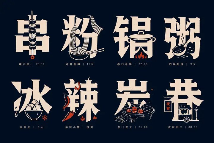
Rainy-Day Commute Tips Matrix Glyph Icon Design
Prompt
Generate a set of image-text integrated glyph icon system around any theme object: each unit uses a large Chinese core character as the main visual, the glyph remains readable, heavy, hard-edged, with a slight hand-cut feel, and key forms derived from the theme are embedded inside the strokes, replace parts of strokes, or hide in negative-space gaps, so that the viewer first reads the character and then discovers the object within it, creating a moment where “character meaning and graphic complete each other.” The overall layout uses a neat matrix arrangement, with stable spacing between units, and a very small auxiliary text below each character; the auxiliary text only serves indexing and rhythm functions, with light weight, tight spacing, restrained alignment, and does not compete with the main character. The graphic language is composed of a mix of high-contrast silhouettes, simplified line engraving, partial outline drawing, and solid blocks. The embedded objects should follow the stroke flow, looking both like illustrations and part of the character, avoiding a separate sticker feel; the complexity of each unit is similar, but the embedding method needs variation, forming an album-like information density and recognition pleasure. Colors are extracted from the theme’s own materials, emotions, and cultural signals, mapped only into role relationships: a large area of low-brightness pure base field provides support, high-brightness main information color handles character and graphic recognition, and a small amount of theme accent color is used only for key details or rhythm points; maintain clear tonal steps, clean boundaries, controlled saturation, and a calm, precise mood. Even if the theme requires dark or vivid colors, keep optical cleanliness, crisp edges, and a transparent background, without using dirty gray, aging, smoke, or muddy color overlays. The final product should look like a systematically designed themed type specimen, with both text readability, graphic memorability, and a compact, orderly layout rhythm. —————— Publishing target: vertical 3:4, for property or company group distribution of a “rainy day commute tip”, the main character can be “umbrella, slip, late, shoes, car, door”.