Minimalist typography cool tone elegant
Prompt
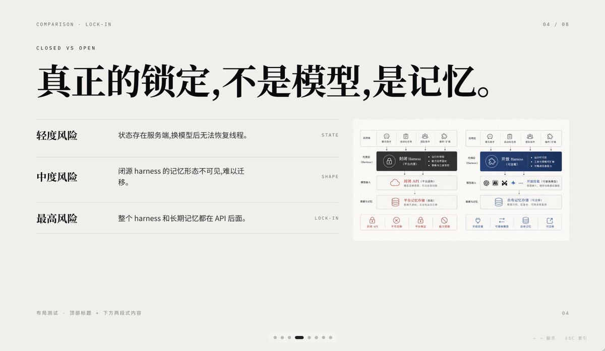
A 16:9 minimalist editorial-style presentation Slides, using a warm light gray paper background, ample whitespace, and a layout following a refined Swiss-style grid, with a high-end PPT/Keynote design aesthetic. This Slides is a comparison page about “Lock-in,” using elegant Chinese typography mixed with tiny English navigation text. In the upper left, place two lines of small uppercase English breadcrumb navigation: “COMPARISON · LOCK-IN” and below it “CLOSED VS OPEN,” using a thin sans-serif with wide letter spacing. In the upper right, place a page number indicator “04 / 08.” In the upper half, slightly left of center, add a line of extra-large bold black Chinese-font title: “真正的锁定,不是模型,是记忆。” In the left area below the title, create three rows of comparison list, separated by thin horizontal lines. The first row has a bold Chinese label on the left, “轻度风险,” an explanatory text on the right, “状态存在服务端,换模型后无法恢复线程。”, and a tiny uppercase English keyword aligned on the far right: “STATE.” The second row has a bold label on the left, “中度风险,” an explanation on the right, “闭源 harness 的记忆形态不可见,难以迁移。”, and the far-right keyword is “SHAPE.” The third row has a bold label on the left, “最高风险,” an explanation on the right, “整个 harness 和长期记忆都在 API 后面。”, and the far-right keyword is “LOCK-IN.” On the right side of the Slides, place a small embedded comparison chart card, with a white background and subtle border, containing two side-by-side system architecture panels. The left panel represents a closed system, using dark gray and soft red accents; the right panel represents an open system, using dark blue accents. At the top of each panel should be 5 small icon labels, in the center a highlighted harness module, below it multiple stacked rounded rectangle modules, and at the bottom row 4 small capability icons with short Chinese labels. Keep the embedded diagram detailed but small in size, so it serves as a supporting visual element rather than the visual center. In the lower left, add tiny light gray Chinese footer text: “布局测试 · 顶部标题 + 下方两段式内容.” In the lower right, place a small page number “04.” At the center of the bottom edge, add a carousel indicator containing 7 small dots, with the 4th dot as a short dark rounded capsule shape, indicating the current page, and the remaining 6 as light gray dots. At the lower right edge, add a faint navigation hint: “← → 翻页 ESC 关闭.” Use crisp vector text rendering, understated contrast, elegant spacing, and a calm high-end infographic style suitable for an AI platform comparison and API memory lock-in business presentation.