 1 / 4
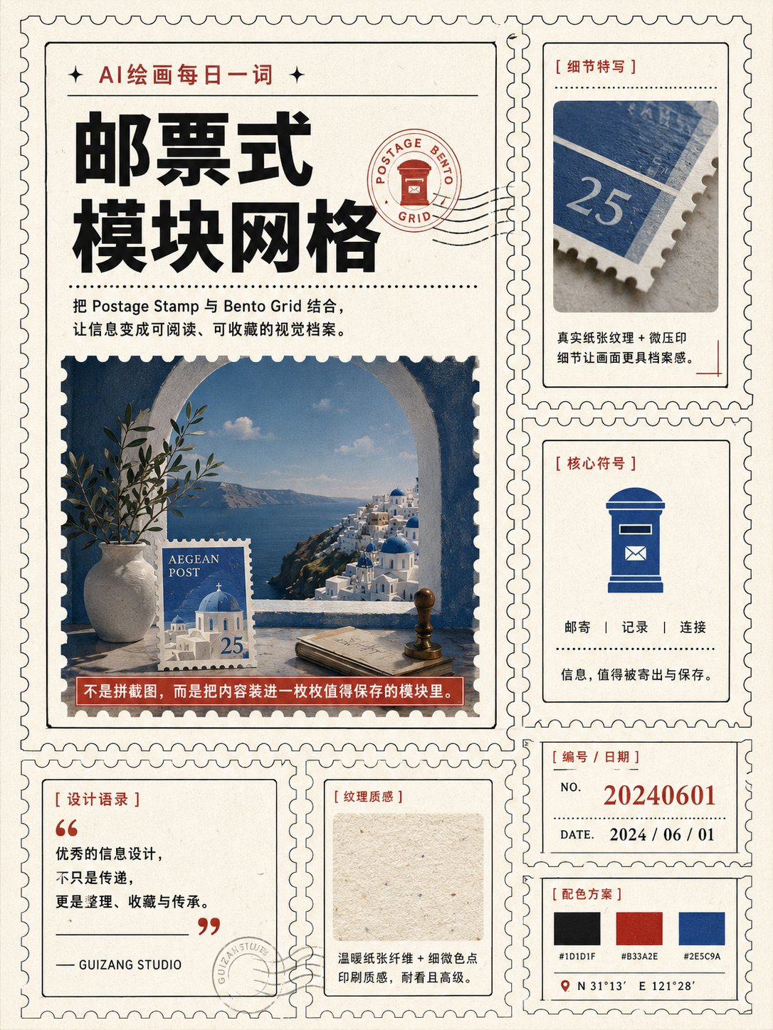
Many people making informational posters run into the same problem: the more content there is, the messier the layout gets. The more modules there are, the more it looks like stitched-together screenshots. Even with rich information, it never feels worth saving.

AigcHello
Prompt
为【主题】设计一张 3:4 竖版“邮票式模块网格”视觉海报,Postage Stamp Bento Grid 风格。 暖白色纸张背景,采用 2列×3行 的非等距模块布局,其中一个主模块占据双倍面积,其余为辅助信息模块。每个模块都拥有细密的邮票齿孔边缘、纤细描边和独立留白,但整体严格遵循统一网格对齐。 主模块展示【核心人物 / 产品 / 建筑 / 主视觉对象】,使用高完成度摄影感画面或精致插画; 辅助模块分别展示:局部特写、符号图形、编号、日期、短句、小型数据或相关元素。 标题使用粗体无衬线字体, 辅助信息使用窄体字体、微型编号和档案式文字系统。 整体配色限定为: 米白、深墨黑、砖红、低饱和钴蓝。 加入轻微纸张纤维、少量油墨套印偏差和克制的印刷颗粒。 整体效果应像现代设计工作室重新设计的一组限量纪念邮票, 具有收藏感和编辑设计感, 信息丰富但秩序清晰。 避免: 凌乱拼贴、过度做旧、花哨贴纸、无意义装饰、廉价复古感。 每个模块只表达一个信息点,主模块最突出,辅助模块层级清楚,整体像一页可收藏的视觉档案。
Explore Related
text-heavy-posters